VERIZON CLOUD WEBSITE
Process
Working with a team including visual designers and UX researchers, we collaborated to enhance the Verizon Cloud experience.
Analyzed the current website including a review of current features here
Created prototypes for user testing
Review results from testing, implemented changes, and worked to develop the changes
Wireframe design and create deliverables for the dev team seen here
Understood the business needs from a Verizon Cloud perspective and created a roadmap future features
The Cloud website needed a re-design to be more useable, user-friendly, and an everyday tool for the customers. After doing some research and testing, we decided the goal for Cloud was to create a ‘destination’ experience.
Hero carousel brings photos to life
Major features of the Cloud include printing photos, music, and contacts.
The FujiFilm section encourages the user to purchase prints,

SUB-NAVIGATION DESIGN
Within the Cloud sub-pages, the Photos & Videos were combined.
Adding subcategories, such as photos, videos, albums, and favorites, creates a system to filter the users' images easier
Moving the sub-pages to the left panel makes this page easier to navigate, browse
Using portrait and landscape images encourages users to stay on the page longer
Surfacing 'Favorites' and 'Sharing' beneath each photo encourages more interactions
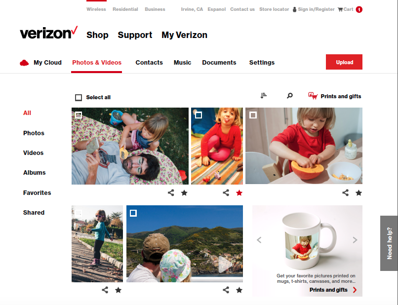
Photo and Video Detail Pages
Annotated wireframes
Full visual design
